Predicting the Effect of Mutations on PPIs Using AlphaFold
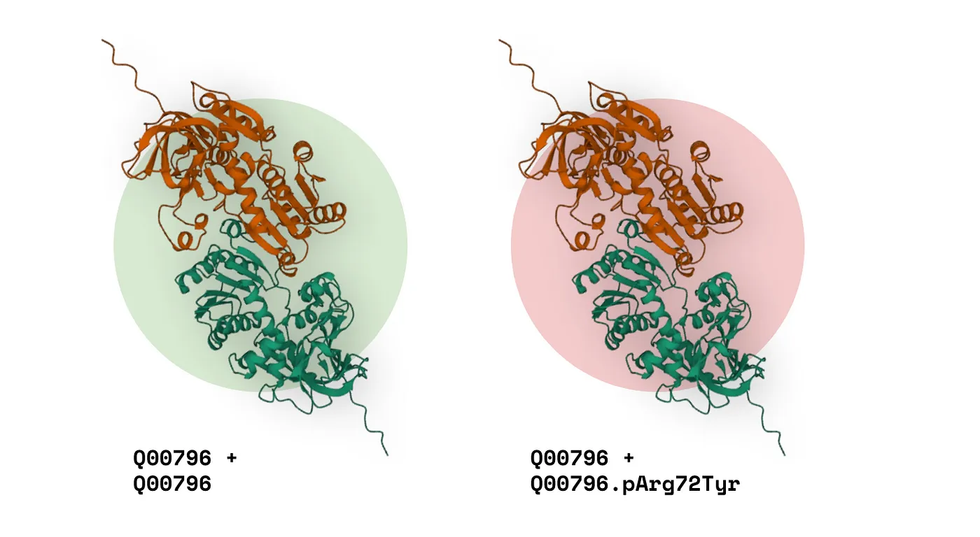
The human interactome, encompassing all protein-protein interactions, may involve up to 600,000 interactions.
Predicting how a disease-causing mutation affects the interactome might seem like a Herculean task—but it’s not as impossible as you might expect, especially when you give a University of Waterloo co-op student free access to a beefy GPU cluster, world-class mentorship, and free agency to pursue any approach.
I used the machine learning framework XGBoost, cutting-edge deep learning software AlphaFold-Multimer (AF-M), and over 47,000 SLURM jobs to build a multi-classifier model that predicts the effects of missense mutations on PPIs with a 91% AUC.
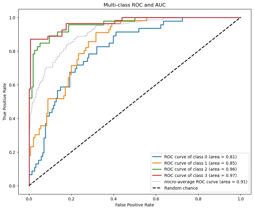 Multi-class ROC curve and AUC (By Author)
In this article, I’ll walk through:
- The Background: The research question and why we chose it.
- Data Acquisition & Processing: How and why we acquired the protein data we did, along with preprocessing steps.
- The Machine Learning Model: The approach for selecting a model and how I implemented it for protein data.
- Results, Model Accuracy, & Feature Importances: Understanding the model’s results and analyzing the important features, class by class.
- Case Studies on ASD-Related Proteins: A deeper dive into two specific model results, focusing on autism spectrum disorder-related proteins.
- Final Thoughts and Lessons: Conclusions, key takeaways, and future directions for this project.
If you’re involved in bioinformatics or molecular biology and want to start incorporating machine learning into your research—this article is for you.
Let’s jump into it!
Background #
In this section, I’ll cover:
- The research question under investigation.
- The rationale for choosing this question.
Not so hot take: protein-protein interactions are important.
I might be biased because I studied them for eight months at The Center for Applied Genomics at SickKids—but I’ve got good reason to think so:
- PPIs are involved in countless metabolic processes.
- Mutations that affect PPIs are overrepresented in diseases (Cheng et al., 2021).
So, if we can understand how and why a given mutation impacts PPIs, there’s a lot we can do:
- Get a fuller picture of disease mechanisms.
- Design better drugs to treat those diseases.
With DeepMind’s release of AlphaFold-Multimer (AF-M), a version of AlphaFold trained with protein complexes in mind, came an opportunity and a question:
Can AF-M capture the effect of missense variants on PPIs?
You might be wondering—why missense variants specifically? As opposed to other kinds of mutations?
Well…
- AF-M can’t predict macro-level structural changes from point mutations.
- However, in silico changes at the interface of a PPI can have measurable changes (observed through a program like ChimeraX).
It’s a research question that lets us take advantage of current technology.
Now—how do we go about answering this question? I’ll answer that in the next section.
Methodology & Approach #
In this section, I’ll cover:
- The central idea behind how we frame this problem.
- A broad-stroke overview of what we’re trying to learn.
3D structures — like the kind AF-M generates — have exclusive observable properties you can’t get anywhere else.
Most of these are structural features like:
- Protein-protein interface area
- Shape complementarity
- Docking score
This is exciting data we can only observe from PDB structures. Given the power of a 3D structure, we arrived at the following approach:
- Take a wildtype protein complex (just a regular old homo- or hetero-dimer).
- Now, take the same complex, except this time with a missense variant in one of the proteins. Effectively, a ‘missense complex.’
If we can detect the difference between the structural features of these complexes and relate it to the specific missense variant, we can find a relationship:
Impact on PPI ~ (structural features).
In other words, impact on PPI as a function of structural features.
Illustration of wildtype and missense complex comparison
But there’s another opportunity here: what if I enriched that structural data with variant annotations, too? Examples include:
- Pathogenicity predictions (CADD, REVEL, AlphaMissense)
- Pathogenicity annotations from ClinVar
- Allele frequency
We’d have many more features to parse a relationship from, developing a more comprehensive function:
Impact on PPI ~ f(x₁, x₂, …, xn)
During my data collection process, I was able to add 40+ more non-structural features on top of the structural ones. This made for excellent training data for an XGBoost classifier model that could predict the Impact on PPI of a given variant out of these four classes:
- Increase in interaction strength. (Binding improves between the proteins)
- Decrease in interaction strength. (Binding weakens between the proteins).
- Disruption of interaction. (The proteins no longer interact with each other).
- No effect on interaction. (The variant does not alter the quality of interaction).
You’re probably wondering—how did I get all this data matching missense variants to PPI effects? And why did I choose XGBoost as my classifier model?
I’ll explain in the following sections.
Data Acquisition & Processing #
In this section, I’ll cover:
- Where I obtained my data (IntAct mutations database).
- How I preprocessed and engineered features from that data.
IntAct Mutations Database #
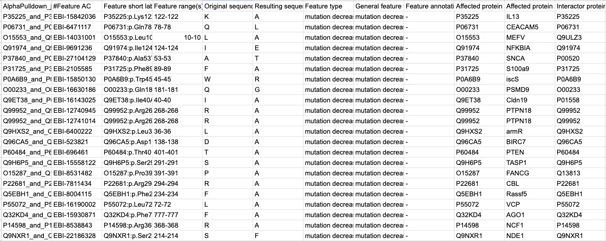
I gathered my training data from the IntAct Mutations database (available under license CC0). It’s a massive annotated record with thousands of missense variants involved in binary protein interactions. Every variant is annotated with its effect on PPI, encoded under the ‘Feature type’ column: increase, decrease, no effect, etc.:
Data encoding in IntAct Mutations database
However, you’ll notice this dataset does NOT include structural feature information or other variant annotations. That’s where I (by which I mean AF-M) came in.
The database contains ~12,000 eligible data points. To save compute and ensure balanced data classes, I randomly subsampled variants until I had ~1,000 for each class. Curious about how random subsampling works?
Random subsampling is when I randomly pull datapoints from a given class until I have enough. This is one approach to ensuring your classes are weighted equally in your training data set so your classifier doesn’t bias towards any single one. Of course, you could also simply assign different weights to each class instead, but random subsampling means I have fewer protein complexes to fold—saving on compute.
Overview of data aggregation pipeline
I then wrote a script that generated FASTA files for the wildtype and missense complexes before feeding them into AF-M to produce PDB structures. Due to time constraints, the final dataset had about 250 structures per class.
Creating a wildtype and missense complex
Wondering how I went from UniProt IDs to PDB structures? This was a relatively simple Bash script that would pull UniProt IDs from the Intact Mutations file and download the appropriate FASTAs via CURL request. We create a wildtype FASTA and then ‘mutate’ a copy to make a missense version. These are inputs for AF-M.
This leaves us with two PDB versions of each protein complex: a wildtype and a missense variant (see image above). Multiply that across ~a thousand binary interactions and 47,000 SLURM jobs, and we have ~20TB worth of data to work with.
Feature Extraction & Engineering #
All I had left to do was extract structural and variant feature information:
Overview of data aggregation pipeline, final steps
The AF-M pipeline I used, AlphaPulldown, simulates a pulldown assay by parallelizing the ‘folding’ of several protein complexes. It also includes a feature extraction pipeline that generates several key structural metrics:
- Interface area (Ų)
- Number of interface residues
- Shape complementarity
- Percentage of polar/hydrophobic/charges residues at the interface
- Docking score
- Protein-Interface score
And beyond. I also added a few features of my own, with annotations from Variant Effect Predictor by Ensembl, available under license Apache 2.0:
Pathogenicity predictions #
Two examples of pathogenicity predictions I used:
- AlphaMissense annotations. These are pathogenicity predictions for every possible missense mutation in the human proteome.
- REVEL pathogenicity predictions. REVEL is a pipeline that produces an average score of several other pathogenicity prediction tools.
Why (and how) I included them:
- If pathogenic missense variants are enriched at PPIs, then the AlphaMissense and REVEL scores will likely be strong predictors of PPI disruption.
- I determined these values by converting the IntAct mutations into a VEP-readable format.
gnomAD frequencies #
gnomAD (the Genome Aggregation Database from the Broad Institute) contains population allele frequencies for several different groups and variants.
Why (and how) I included frequencies:
- Variant frequency data could also help us learn whether common or rare variants are more prevalent in PPI-disrupting pathologies.
- I found these values by converting the IntAct mutations into a VEP-readable format.
Relative ratios #
I engineered simple ratio features, like the interface area / total surface area, the differences in feature x from the wildtype version, etc.
Why I included relative ratios:
- While an unsupervised algorithm could make these kinds of calculations without help, a supervised model like XGBoost benefits from these ratios.
- Intuitively, we could also predict that if the ratio of interface area to total surface area falls, we’re observing a weakened interaction. (This is just one example).
Free energy #
Using EvoEF2 (available under the MIT license), I obtained thermodynamic data on protein complexes, comparing 𝚫𝚫G (the difference in Gibbs energy of the folded and unfolded protein states) of the wildtype and mutant variants.
Why free energy:
- We’d expect higher free energy predictions from a complex with PPI-disturbing mutations, suggesting a more unstable interaction.
By the end of it all, I had a tabular dataset that looked a bit like this:
One thing about bioinformatics tools, however—they don’t always work. Metrics for a given variant will often be empty or missing. For example, not every variant in IntAct has an associated gnomAD frequency.
Wondering why can missing values make ML challenging? It probably makes intuitive sense as to why missing values are problematic in any machine learning task. Given an incomplete picture of the dataset, it can be hard to trust the output of your model. Luckily, there are methods for dealing with our trust issues.
Missing values are pretty annoying whenever you do machine learning, so I had to pick a model with the right chops. Luckily, XGBoost had what it took—let me explain how.
The Machine Learning Model #
In this section, I’ll break down:
- XGBoost, and why I chose it.
- Hyperparameter tuning & cross-validation.
XGBoost #
XGBoost is a gradient-boosted decision tree model.
Decision trees are graphs that split data at threshold-based nodes. Here’s a simple model of deciding whether or not to play outside today:
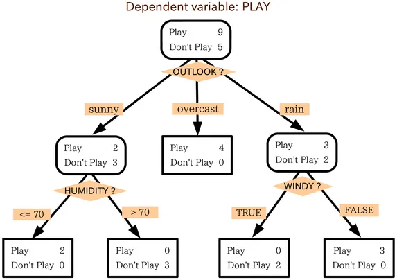
Decision tree diagram
Chaining several of these trees together in sequence allows each one to correct on the error of the last one, building a much more robust model. This is what makes it ‘gradient-boosted.’
XGBoost is a lightweight, fast-training model that has several advantages for this particular task:
- It doesn’t need normalized data. This is great for several reasons. For one, it means less work for me. More importantly, however, it makes it much more straightforward to interpret how the model arrived at a conclusion.
- It can handle multiple data types. This includes categorical and nominal data—this is a more experimental feature, however, and I simply used encoded dummy variables myself for the categorical data.
- It’s a supervised model. Artificial intelligence is doing incredible things for science, but it’s easy to get lost in the code. Ultimately, the goal here is to learn something about biology. Since supervised models let us pop the hood behind classifications, we can investigate the biological mechanism behind a PPI outcome in more detail.
- It has robust handling for missing data. Remember how I mentioned not all variants have full annotations? They might be missing frequency information, for example. Or maybe EvoEF2 bugged out, and I need thermodynamic information. XGBoost has methods to ensure this doesn’t shut down training altogether.
How does XGBoost handle missing data? The model treats missing data as essentially their own kind of value. At a splitting node, the algorithm determine which direction (left/right) leads to the highest gain (best reduction of the loss function) and encodes that decision into its training. When it encounters a similar missing value in the test set, it’ll make the same decision.
Since the dataset had reasonably sized dimensions and XGBoost trains so quickly, I decided to include a hyperparameter tuning step using k-fold cross-validation:
Hyperparameter tuning & k-fold cross-validation #
Any machine learning model will have internal parameters—the weights and biases it ascribes to its internal classifications.
However, ML models also have hyperparameters, which are higher-level structural settings for the overall model. These parameters are set before training and can significantly impact accuracy outcomes.
Here are the ones I focused on:
Max_depth: max depth of a treeLearning_rate: contribution of each tree to the final resultN_estimators: number of treesSubsample: training set fraction sampled for each tree
We determine the optimal hyperparameters by testing several combinations and selecting the one with the best results—in other words, by tuning.
To add even more robustness to the model training, I implemented a k-fold cross-validation step. What is that exactly?
Let’s break it down:
- In ML, we typically split the dataset into a training and test set. Sometimes, we risk overfitting the model to the training data, making our model less useful.
- To combat this, we can split our dataset into a number (k) of segments. Then, for k different models, we select one segment as our test set and combine the rest as our training data.
- We repeat this for k segments, shuffling our data so we never overfit to just one training/testing split.
By MBanuelos22 from Wikimedia Commons, CC BY-SA 4.0
We do this for every hyperparameter combination, ensuring we get the highest accuracy model possible.
Now that we’ve got a model trained and tested, how good is it? What can it teach us about biology? We’ll cover that next:
Results, Model Accuracy & Feature Importances #
In this section, I’ll cover:
- How accurate the model is, and what those accuracy metrics mean.
- Class by class, which features are the strongest predictors.
Confusion matrix & ROC curve #
To assess the quality of a multi-classifier, you’ll typically use a confusion matrix:
Figure 1. Confusion matrix
The confusion matrix visualizes the test set. Along the bottom, we have what the model predicted for each data point (a protein complex), and on the y-axis, we have the actual value for each data point. The lighter the colour of the diagonal, the more accurate the model.
- For instance, the model correctly predicted 47 of the 54 class 3 protein complexes (see the bottom row).
- We see a similar level of accuracy in class 2, with 39/46 complexes correctly classified.
- In the upper left corner, the model had difficulty distinguishing between classes 0 and 1 (mutations decreasing and disrupting interactions, respectively). Intuitively, this makes sense—they have similar effects.
The confusion matrix is just one way of assessing the model’s accuracy. We can also use an ROC curve:
 Figure 2. Multi-class ROC curve and AUC
A receiver operating characteristic (ROC) curve plots FPR vs. TPR:
- True positive rate (TPR): the ratio of true positives to actual positives [TP/(TP+FN)].
- False positive rate (FPR): the ratio of false positives to actual negatives [FP/(FP+TN)].
The points along the curve indicate different threshold settings. The threshold refers to the cutoff point where we distinguish between a positive and negative case.
In a multi-class ROC curve, the positive case is a given class, and the negative case is all the others (one-vs-all). The diagonal (dashed line) refers to random chance, where TPR = FPR at all thresholds. One way to think of accuracy is that the further we are from this line, the better the model.
- At the left bottom of the graph, a high threshold can lead to few false positives (low FPR) but also many missed true positives (low TPR).
- As you move right, the threshold decreases allowing more true positives (high TPR) but also letting in more false positives (high FPR).
The ideal classifier has a bowed-out shape, where we have a high TPR at low FPR rates, even at high thresholds. We see this for most of our curves.
- TPR = ∑cTPc / ∑c(TPc+FNc)
- FPR = ∑cFPc / ∑c(FPc+TNc)
Microaveraging the curves involved summing each class’s TPs, FNs, and TNs (seen above).
This gives us an overall picture of our model’s performance. To standardize our comparison, we calculate the area under the curve. Closer to 1 = more accurate. As seen in Figure 2, we achieve a micro average AUC of 0.91.
You can also see that the curves for classes 0 and 1 reflect what we saw in the confusion matrix. Overall, we have a reasonably accurate model. But now comes the fun part—what can it tell us about biology?
SHAP values #
Using SHAP values can help us determine how much the features in a model contributed to each prediction.
What are SHAP values? Shapley Additive exPlanations measure the marginal contributions of each feature to a class prediction. In short, they measure feature importance. SHAP values are useful because they work for any supervised machine learning task.
They’re determined by:
- Taking the average prediction for a given class.
- Iteratively adding each feature in (in all possible orders) and evaluating the output.
- Calculating the marginal effect of a feature on the model output’s distance from average.
SHAP values are biologically useful because they can tell us which structural features require more study, or which pathogenicity predictions are most accurate.
Here are the top ten feature importances for the entire model:
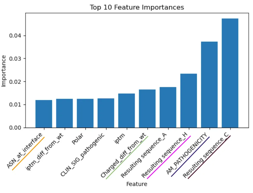 Figure 3. Feature importance
From my analysis, I saw some interesting results.
- For one, the impact of the resulting amino acid from the missense mutation being cysteine (C) was surprising and challenging to explain.
- Not so surprising was the importance of the AlphaMissense pathogenicity score—both AlphaPulldown and AlphaMissense (in one way or another) rely on the MSAs from AlphaFold.
- Interestingly, the magnitude of the difference in the percentage of charged residues at the interface between wildtype and missense complexes also plays an important role.
Realistically, finding one or two features globally predictive of PPI effects is a fruitless exercise. We’re better off looking at feature importance class by class using SHAP values:
Class 0: Decrease in interaction strength #
On the left, I have a feature importance plot showing the average impact of a feature on the model’s output. This graph is relatively simple to interpret; the bigger the bar, the greater the magnitude of impact.
On the right, we have a beeswarm plot. These kinds of plots help us map two factors:
- Impact on outcome likelihood: Dots on the right of the center line mean those feature values have a positive effect on the class prediction (i.e., they make it more likely to be predicted). Likewise, dots to the left have a negative effect (they reduce the likelihood).
- Feature value: The colour of the dots is also essential. Blue dots represent a low feature value, while red dots represent a high feature value.
We can combine these two factors to further our understanding of the feature effects. I’ll use the Resulting_sequence_A feature as an example. (Background: this is a dummy value, so values are either 0 or 1).
- Dots to the right of the center are red: when
Resulting_sequence_Ais high, it increases the likelihood of predicting class 0. - Dots to the left of the center are blue: when
Resulting_sequence_Ais low, it decreases the likelihood of predicting class 0.
In natural language, it seems alanine as a missense residue has a strong effect on decreasing interaction strength. This tracks intuitively—alanine is a small amino acid with only a methyl group for a side chain.
This limits the kind of interactions it can participate in. So, if it replaces a crucial disulfide bride or prevents a charged interaction, it makes sense that it would increase the likelihood of decreased interaction strength.
Combining wet and computational biology for a better model. While there is a biological case to be made that this finding reflects reality, it’s also true that scientists often conduct alanine-scanning studies where residues are sequentially replaced in a protein sequence to determine which ones are important in folding, interaction, etc.
It’s possible the results from these studies are overrepresented in the IntAct database, biasing the model to think this feature is more important than it is. Interestingly, it was crucial I have background in ‘wet’ biology to understand issues like this. Otherwise, I may not have even realized this was a potential problem.
We see some unexpected results with the shape complementarity (sc) feature. sc measures how well the two proteins fit into each other; we’d expect that when sc is low, it increases the likelihood of decreased interaction strength between two proteins. However, this is not the case: higher sc seems to decrease interaction strength, and vice versa.
In the following sections, I’ll only call out a few features I found interesting:
Class 1: Disruption of interaction #
SIFTis a normalized variant effect prediction score between 0 and 1. Low scores (0–0.5) are predicted to affect protein activity. We see the expected results reflected in the beeswarm plot, adding to SIFT’s strength as a tool.Total_free_energy_diff_from_wtis an engineered feature that measures the difference in the EvoEF2 free energy between a missense complex and its wildtype equivalent. A significant difference (high value) suggests a more unstable missense complex (and v.v.), which appears to be reflected in the plot.
Class 2: Increase in interaction strength #
Resulting_sequence_A: For whatever reason, missense mutations resulting in a cysteine residue have a surprisingly strong, positive effect on the likelihood of increasing interaction strength. Cysteine can form disulfide bridges across dimers, one of the stronger bonds. While this may lead to enhanced interactions, I wonder why this is the most impactful feature?iptm & iptm_ptm: These values measure AlphaFold’s confidence in the models. It seems to track that if two proteins ‘make sense’ in a complex (illustrated with a high iptm_ptm), they would have strong interactions. In the reverse case, if AlphaFold has low confidence in the structure, it could mean these proteins are unnatural in complexity, thus reducing the likelihood of class 2 prediction. However, it could also simply mean the 3D model is inaccurate and should be disregarded—I cannot make any solid conclusions.
Class 3: No effect on interaction #
AM_PATHOGENICITY: This is a pathogenicity score from AlphaMissense based on conservation scores for every residue in the human proteome. It seems to be a relatively strong predictor of non-pathogenic mutations, with low pathogenicity scores associated with an increase in the likelihood of class 3 prediction.pDockQ: A docking metric that measures (like sc) how well two proteins complex together in 3D space. A good docking score, as expected, seems to be a strong predictor of a non-perturbational variant.gnomAD_exomes_AF: The variant’s exome allele frequency from gnomAD suggests low-frequency variants are associated with unperturbed protein complexes. However, we’d have to see the range of frequencies to determine if we’re looking at rare or common variants (These classifications require frequencies between specific thresholds).
All in all, some interesting results. Now, let’s apply the model to some novel protein complexes to see if we can learn anything new:
Case Studies: ASD-Related Protein Complexes #
In this section, I’ll:
- Look at two specific examples of protein complexes analyzed with the model.
- Provide a literature-based (potential) explanation for both.
This is all fun and interesting, but what’s the point of machine learning in molecular biology if we haven’t learned anything new?
So, for the application part of this project, I used the model to analyze a few coding missense variants from the MSSNG database, a repository of whole genome sequence and annotation data designed to study autism spectrum disorder (ASD). (The Scherer Lab specializes in studying the genomics of ASD).
MSSNG is a vast body of data, so I refined my analysis to only a subset that met the following criteria:
- Coding missense variants (restricts for affected proteins).
- Ambiguous pathogenicity predictions from REVEL and AlphaMissense (so the model could help generate some new information).
- Have known direct interactions according to the IntAct database (the only type of interaction the model is trained on).
- Meet a PAE cutoff of 15 Å when folded using AlphaPulldown (restricts for high confidence in the relative positions of protein domains).
Here are two of the standout variants from this subset:
- Androgen receptor & tyrosine protein kinase (AR:YES1.p.Q234R)
- Transcriptional coactivator & zinc finger protein (YAP1:GLIS3.p.G448D)
The model predicts Class 1 (a disrupted interaction) for both variants. Let’s take a closer look:
Androgen receptor & tyrosine protein kinase (AR:YES1.p.Q234R) #
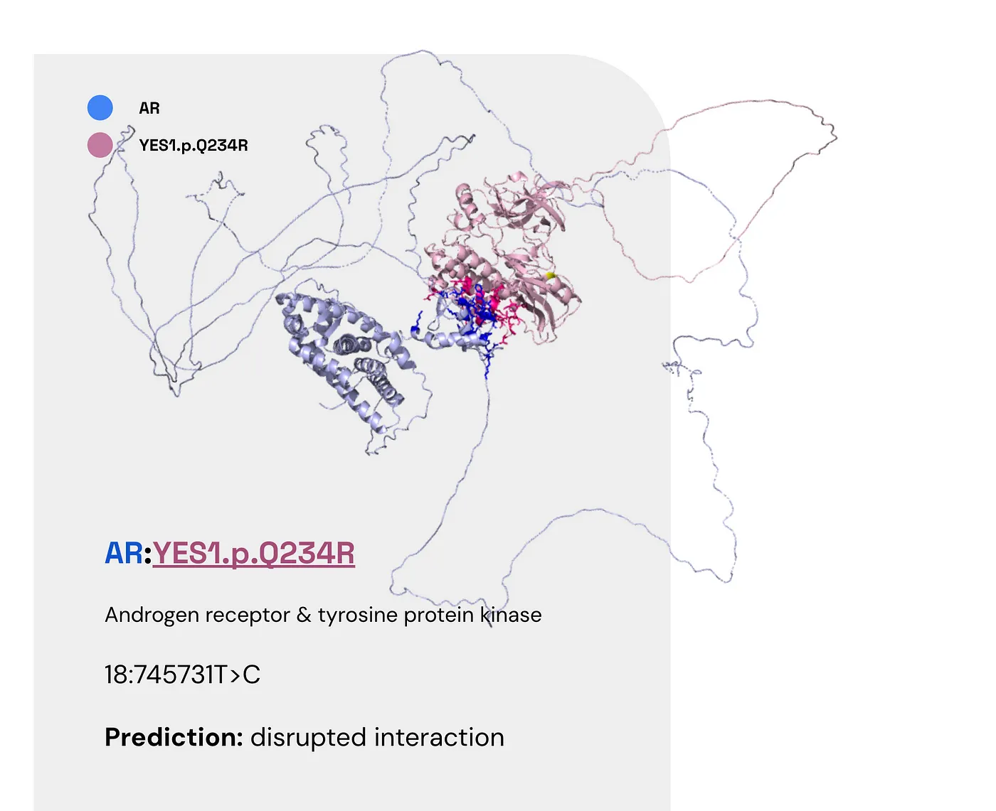
Here are the facts:
- AR (the androgen receptor) is found in the heart, skeletal muscle, and the prostate (UniProt).
- Tyrosine phosphorylation of AR has been linked to tumour growth (Guo et al., 2006).
- Some evidence suggests an inverse comorbidity between ASD and prostate cancer (Fores-Martos et al., 2019).
So here’s one potential story:
- A disrupted interaction between AR and YES1 reduces tyrosine phosphorylation, thus lowering cancer risk.
- Inverse ASD and prostate cancer comorbidities may explain this variant’s role in autism.
Unfortunately, there are a few issues here:
- YES1 is only expressed at low levels in the prostate.
- Moreover, it’s the non-receptor tyrosine kinase.
- Plus, there is also evidence running counter to the ASD-prostate cancer comorbidity finding.
The bottom line is that there are no conclusive results from the model. For your interest, here are the SHAP values that lead to this prediction. Note the comparatively high difference in interface solvation energy from the wildtype.
Transcriptional coactivator & zinc finger protein (YAP1:GLIS3.p.G448D) #
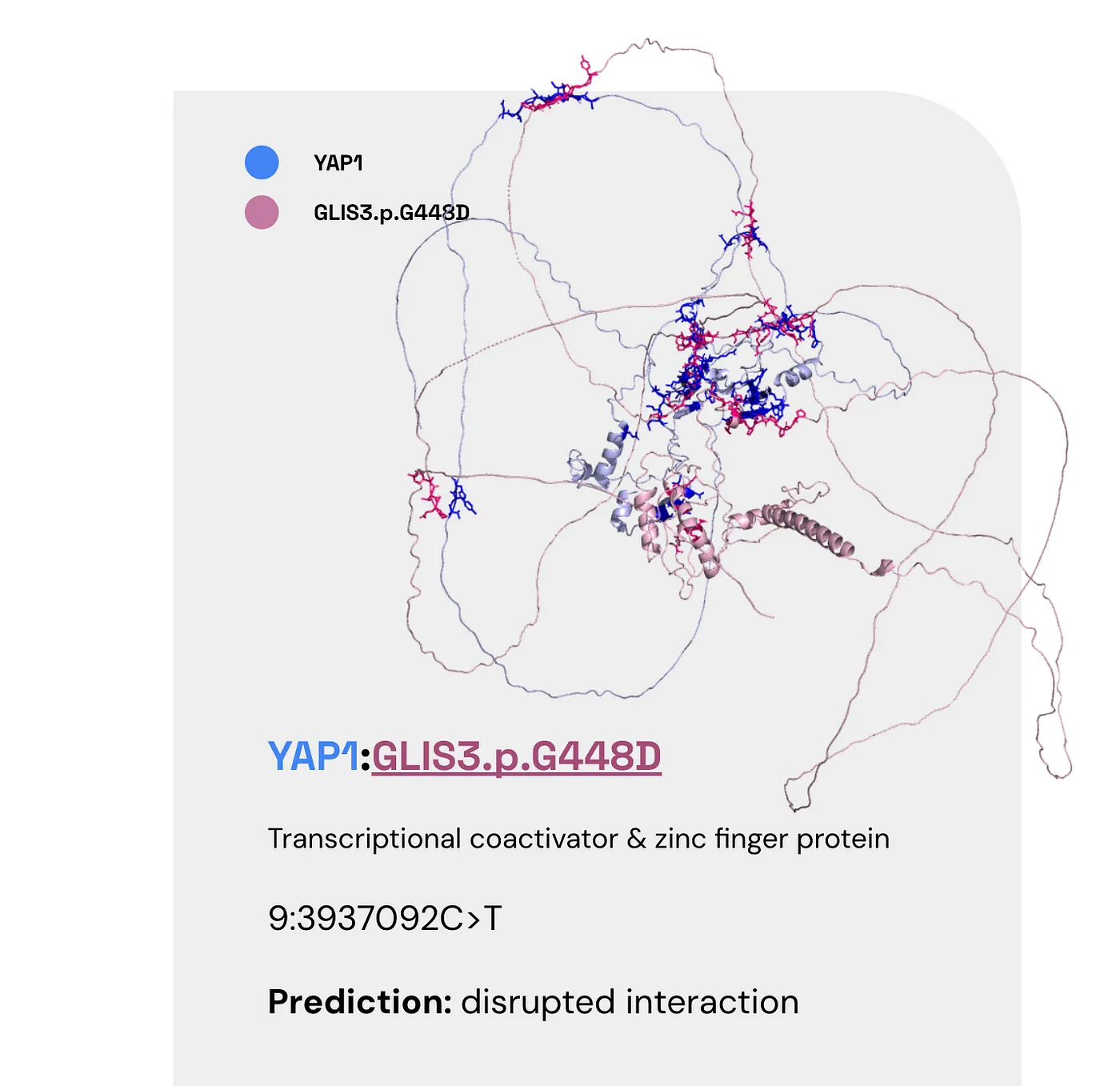
Once again, here are the facts:
- YAP1 can coactivate/repress transcription and is found in the liver and the prostate (also at low levels in the brain).
- GLIS3 is also a transcriptional activator/repressor found in the kidneys, brain, and liver.
- Several GLIS3 binding sites are associated with neuropathologies, affecting nervous system development and synaptic transmission (Calderari et al., 2018).
- GLIS3 may also affect autophagy regulation (Calderari et al., 2018).
One possible story here: Disrupted interaction between these two proteins may expedite the progression of neuropathologies that result in autism.
However, gleaning a more specific mechanism from this research is a challenge.
Once again, here are its SHAP values:
So far we’ve trained a reasonably strong model, interpreted its results, and used it to learn more about biology. What are the takeaways? And what’s next?
Final Thoughts and Lessons #
Future Directions #
I spent about four months at TCAG working on this project, much of which was spent collecting training data. (Not to mention the four months I spent there previously getting accustomed to AF-M).
Given more time, here are steps I’d take to expand the project:
- Gathering more data. With a limited dataset, there’s only so much faith we can put in the results from this model. More PDBs, ideally experimental ones, are step 0 to improve the model.
- Engineering new features. Taking a deeper molecular biology approach to feature engineering may increase the model’s accuracy.
- Use the model for pathogenicity prediction instead of mechanism prediction. Currently, the model predicts the impact on PPI (Feature type from the IntAct mutations database). An alternative approach would be using the enriched data for pathogenicity prediction, a la REVEL.
- Testing the model on more unexplained variants. As it stands currently, I was only able to test the model on a few variants of uncertain significance. Analyzing more PPIs could create further research threads to pull on.
However, I’m quite proud of what I achieved and learned in this timeframe.
Conclusions & Key Takeaways #
I can’t imagine many students are given free rein over such an exciting research question, access to world-class mentors, and one of Canada’s largest compute clusters.
But I did.
So, I’m incredibly thankful to everyone involved (Dr. Brett Trost, Dr. Richard Wintle, and Dr. Steve Scherer, to name a few).
Working in the Scherer Lab showed me research doesn’t have to be stale, slow, and tedious. With the right team and vision, it can be fast, dynamic, and cutting-edge.
On a macro-scale, I’ve learned how crucial AI/ML will be to the future of computational biology.
- My initial approach to this project was creating a graph structure to observe and track the structural differences between wildtype and missense complexes.
- When I realized the magnitude of the statistics needed to determine the differences between the two, it dawned on me that ML could save the day here.
What are your thoughts? #
I’m happy to get your feedback, questions, compliments, and curses. Thanks for reading!